Monday, March 31, 2008

Open House & Portraits

Here's the finished design for the UArts open house poster. I had a lot of difficulty with the design of the type and there were certainly a bunch of variations over time, but I finally came to this solution. I think it's iconic, central, and the scribbly nature of the font is nice and hip but says "school" to me as well. So hooray for that sweet font.

Coming down the line, the next portion of the workshop I'm participating in will be doing portraits of people based on their obituaries. The 2 people I'll be doing are John List and Pearl Cornioley. The former is a multiple murder who killed all 5 members of his family, saying the world was so filled with evil and that he didn't want them to suffer it anymore (he then fled the scene, changed his name, and remarried). He was caught 18 years later and died in prison.
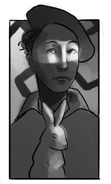
Pearl, on the otherhand, was a resistance fighter in World War II France. She was renown for being an undercover operative who was in command of 1500 resistance fighters. She traveled with her pet rabbit everywhere she went and was the best shot in her sector.

Thursday, March 27, 2008

An Introduction


The above are the sketch and finished drawing for my new frontispiece. Now's the time to get my portfolio together and make a new book for myself. Arguably, the portfolio as an actual book is getting to be a little outdated- websites for illustrators have become such an integral tool for getting your work out there easily, quickly, and with the ability to add new material constantly. Nonetheless, I'm looking forward for the chance to take a few weeks and really think about my arrangement, what goes in it, and focus on producing a high quality, real, physical object made for showcasing my work.
In making this book, I had thought that I should create a new frontispiece rather than taking another work out of the book and placing it in that context. It took me a while just to think of an idea- an image that exists only as something of an introduction to my work. It may sound silly, but I've had fish on my mind lately- maybe because I'm trying to branch away from my love of drawings birds and other aerial creatures. Juxtaposing a glimmering fish with a long graceful tail with a nice juicy sky was a good way of making myself a beautiful piece that's also simple and allows room for me to put my information on the very front page; a nice solution for my intro piece.

Monday, March 24, 2008

Virtue and an Opening


This is the final art for the Virtue piece, Vice's counterpart. Unlike Vice, I wanted this figure to look nurturing, compassionate, and unconcerned with the viewer as she ascends. I enjoy doing these type of pieces, people floating, and I feel this is one of the most successful pieces that I've done recently.
In other news, anyone who may be stopping into Philadelphia during the next month should invest sometime in the University of the Arts' Illustration Thesis exhibition. Called the "Ely," after William H Ely, the show was hung on Friday and is up, I believe, until April 21st. There's a lot of great work hanging in this show so I urge anyone in the area to check out a new batch of rising illustrators. The actual reception is on April 6th in the main building of the school at Broad & Pine St.s.

Wednesday, March 19, 2008

Neverwhere

I did a design for the cover of Neil Gaiman's Neverwhere around the ideas of keys. The object itself, a literal key, plays largely into the plot of the book but so too does the idea of opening doors and unlocking things; be they worlds, trials, or doors to other places. I wanted the design of the key to be a bit ornate to reflect on the fantasy of the book as well as the society Gaiman invents. It's one of strong tradition, legend, and ritual. It's also a world of many secrets, and so even the key itself has the shape of a keyhole on it.
When I started the project, only the key initially came to mind but it wasn't a strong enough concept to move forward with. Later, I thought I could tie in notions of perception and reversal by using the Rorschach pattern. The main character is mentally tried throughout the novel and several times the idea of insanity comes into play, so I figured the iconic inkblots could embody those connotations.

Tuesday, March 18, 2008

Back from Peru

Back from Peru with a new finished drawing and a refined sketch that I posted previously. The drawing is a poster for the University of the Arts annual Open House. The girl is the focus of the piece and the bid above her head is used to communicate that there's something special that separates her from the crowd she walks against. In the finish I want that bird to be like a jewel, that something that she has is beautiful.

The sketch is for my depiction of Virtue. She's lifted into the air, floating, cradling something precious to her heart. I definitely wanted her to be unconcerned with the viewer, unlike the depiction of Vice that this is paired with. Vice looks at the viewer, there's a bit of narcissism in that, but its counterpart is above that.

Thursday, March 6, 2008

It's a Baby

I had posted a sketch of this portrait so I thought I might as well post the finished piece as well. It's painted digitally, in Photoshop, over the drawing I did. The client wanted it to be fairly straight forward so I didn't have a great deal of room to stylize the face, but the lighting and background were nice places to have fun with. It was a good opportunity for me if just because I don't really delve to much into the straightforward portrait. That, and painting infants/babies were a fun change from my normal adult age group.
I'll be gone for the next week in Peru so I figured I would post sketches of pieces that I will need to finish after I come back. They're for a follow up to the Vice sketch, Virtue, and a design for an Open House poster at the University of the Arts here in Philadelphia, respectively.

Sunday, March 2, 2008

Dead Souls and a Baby


This is the final of the sketch I posted earlier. Again the idea behind this is that sin/vice decay the soul. This girl, maybe she was pretty at one time, has fallen into sin and given up. She looks at the viewer without respect as we watch her soul disintegrate. It's always fun to be able to get a little crazy with skin tone and I had described the palette for her skin as "wet corpse." A lot of purples and blues and some greens too. And, just because I like them a lot, a nice red in the hands and nose.Agreed, not quite in the same vein, but a private commission. I'm actually rather looking forward to doing a more traditional portrait, seeing as it's not my normal fare. It'll still be a fun portrait if just because I have free rein with the background. I'm thinking birds and clouds.