Sunday, April 27, 2008

Cthulhu!


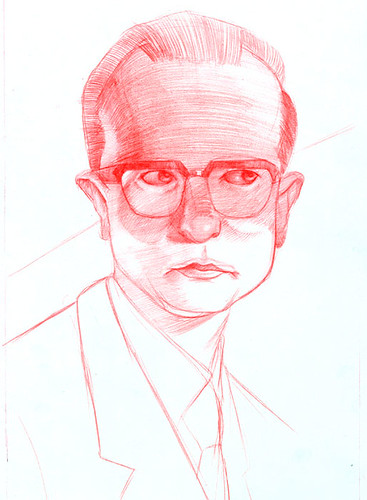
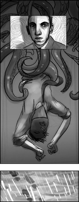
Well, not entirely. This is a piece inspired by HP Lovecraft and the Cthulhu mythos. HP Lovecraft led a life that not surprisingly led to his writing/defining a genre of horror writing that tackled ideas like insanity, beings outside of human understanding, and of course the idea that there are sleeping gods of an ancient world who wait to take ours. He was sickly as a youth, lived under his mother for a long time until she became hysterical and died. The picture is of a proper-dressed figure struggling against a swarm of tentacles, surrounded by vignettes of Lovecraft and celtic spirals, and muddy, ominous footprints in the rain.

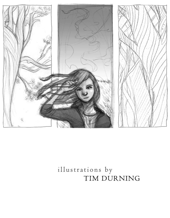
This is another design for an intro piece in my portfolio. I got the suggestion to make it more figural, if just because so much of y work involves people. The girl is in a field of tall grass with clouds in the background, and on either side are details of my finish drawings. I wanted the background to be made of elements from two of the boxes in my last intro piece, which is now the end of my portfolio, so that front and back can relate a lot more closely.

Friday, April 25, 2008

Hands and Roots

On May 20th there's going to be a big ta'do. It's a large collection of artists showing their portfolios to a hopefully large collection of art directors from all over New York. To invite the large list of directors, editors, art buyers, etc we wanted to all come together with proposals for a postcard image. The above was my idea and in it I wanted it to be a little odd/surreal but also have notes of preciousness and growth. It ultimately was chosen but I like the picture aside from that if just because I was nervous about the area where the hands turn to branches but it worked out great! PS- look at it upside down and it's pretty cool too. And below is the drawing. Cause I like'm.

Wednesday, April 16, 2008

Introduction

I wanted to try out a different approach for the front of my portfolio. Instead of the fish, I decided to try out 3 distinct environments that are all kind of elemental in a way but that the panels easily relate to me in one way or another and they'll look nice layed out on the page with all of my information. My hope is that this will give people looking at my portfolio something of a quick primer to the mood and look of my pieces.

Monday, April 14, 2008

American Illustration 27


Just a quick note, one of my recent pieces got Chosen for the 27th American Illustration annual and is going to be displayed on their website. Pretty cool if I say so myself.

Sunday, April 13, 2008

Hero Portrait

This is a portrait of Pearl Cornioley. She died on February 23rd. In her lifetime she was an Allied agent in WWII France. She parachuted behind enemy lines and armed the resistance movement under the alias, "Pauline." A stunning marksman who traveled no where without her loyal hare, she led almost 3000 people, killed and wounded over 1000 Nazi soldiers, and orchestrated the surrender of 18,000 Nazi troops.
The portrait is primarily about the secrecy that was inherent to her duties which is the reason for the slat of light on her eyes. Personally, I like that rabbit. She was ultimately brave and devoted to the cause. The kind of woman who in many ways puts us to shame, but who's example inspires us as well. Below is the finished drawing for the piece.

Tuesday, April 8, 2008

John E List

This is the final for my portrait of John List, the New Jersey man who in 1971 killed all 5 members of his family. Reading about these murders is like something out of a movie. He was failing professionally and stealing money from his mother but one night killed everyone in his house. Neighbors say they saw each light in his house go off one at a time, and then John was gone. All that was left were corpses and a note that said he saw too much evil in the world and wanted to spare his family the pain of living in it. He was caught 18 years later, remarried with a name change.
Anyway, reading all of this back story to his dying in prison a few weeks ago of course meant that it was creepy portrait o' clock. I wanted to keep the palette almost like an old photograph, but then threw in the reflected light of a weird purple/lilac. Look at'm. Shifty, I tells ya.

Thursday, April 3, 2008

Photo Card and a Drawing of a Killer

This is the almost-finish for the card that will be going out to promote a photography show. I say almost finish because the client apparently got concerned the message would be jumbled by not having a photograph on the cover (I wonder why....). So, instead of painting some sort of BW photograph, she wanted space in which she can place an actual photograph. I think the juxtaposition could be awkward but we'll have to see how it looks in the end.

Here is the final drawing for the portrait of John List I'll be doing very soon. I put up these drawings because, for some reason, I've got this attachment to the actual pieces of paper I do my finished drawings on so I figure if they're not always visible in the finishes themselves, I'd better show them here.

Tuesday, April 1, 2008

Photography Promo

I recently got a job to do a promotional card for a photography show here in Philadelphia at Gallery F.U.E.L. Now, granted, I thought it was a bit odd to use an illustration as a way to sell a photography show but, I thought it might be best to not mention that particular point. The girl commissioning me said she wanted a way to show a collection of works or a multitude of photos because there will be a lot of artists showing. Specifically, she referenced my Clive Wearing piece and the floating papers. Riffing off of that idea, I thought a flutter of photos might be a neat approach, with one particular piece engaging you. And just for a different perspective, a sketch showing a girl in the show itself. It's kind of a rush job so look forward to the finish soon.