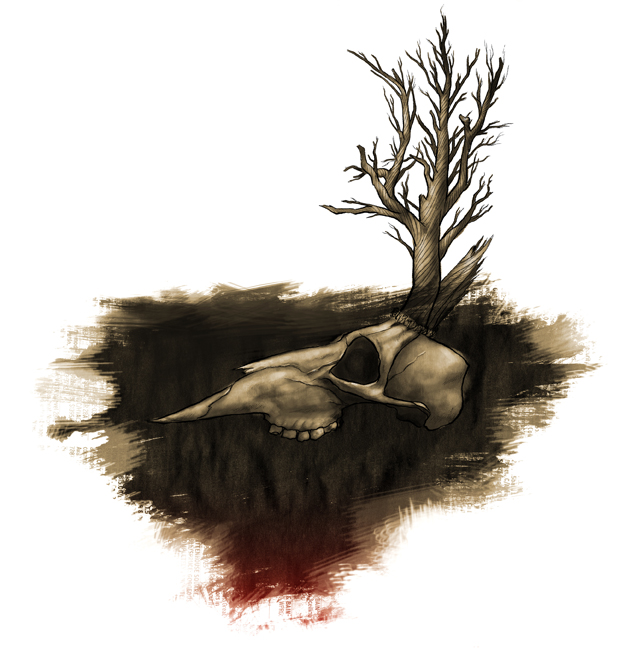
 This is an idea I've wanted to try out for a while now. It's one that I pitched to a different assignment months ago, but which at the time was a little too conceptual for what the article called for. Originally I saw it as a black and white piece, but it seemed to work a lot better with the red as a sepia. Admittedly, something is bugging me about it. I feel like there should be another element or facet to this piece that's just not there right now. I'm satisfied with the image as it stands but there's something that can push it further. Once I figure that out, maybe I'll share that here.

No comments:
Post a Comment