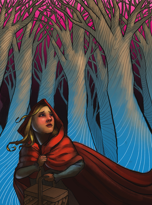
 Following up from the previous post, here's the finished product for Into the Woods. I began my approach with a very traditional color scheme (brown trees, a warm yellow sky, etc), the art direction being only that Red Riding Hood should be composed of rich primary colors. She stayed very much iconic that way, but the picture had been lacking in my estimation until I thought to try out a drastically different color scheme. Now looking at it I like the the juxtaposition of her very "realistic" or worldly colors and the eerie, other worldly quality of the woods.
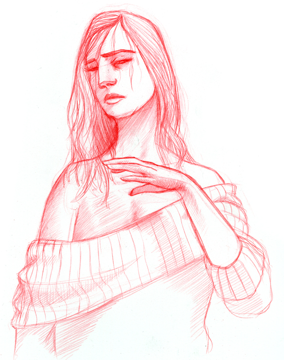
This is a continuation of the Vice illustration. This is a finished drawing/sketch that I approach each project with. Not a particularly big step, but personally I enjoy the look of the warm reds and the raw quality these drawings have so I thought I would share another one.

1 comment:
B E A UTIFUL
Post a Comment